 BUY ART


Galerie bei der Albertina | Zetter
Markus Prachensky: The Energy of Red
Abstraction and the colour red are the two central constants in the work of Markus Prachensky, which occupies a distinctive place within Austrian art. The artistic and personal path to this point was marked by particular intensity: by a mood of new beginnings in the early years, by curiosity, friendships, travel, passion and an extraordinary amount of talent. From the outset, Prachensky was fascinated by the intellectual and artistic spirit of optimism in post-war Vienna.
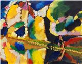
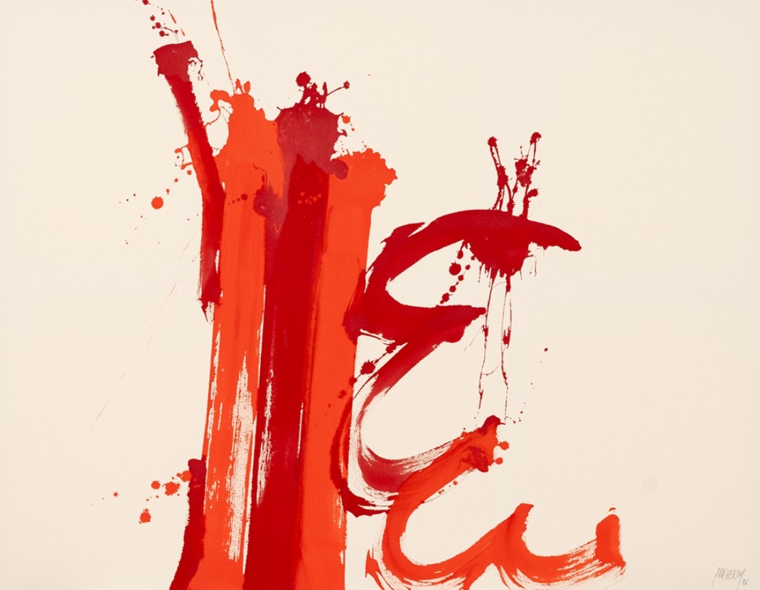
Prachensky’s artistic beginnings were initially marked by geometric abstraction, from which he soon moved away. The work on paper ‘Rouge sur Noir’ from 1958 shown here is evidence of this development: a gestural movement in the painting process is combined with red paint on a dark background. In the 1960s, the backgrounds of the paintings changed. White and grey replaced the dark backgrounds.
At the same time, the gestures of his painting became more dynamic and impetuous. The rhythm of his brushstrokes now often resembled calligraphic characters. While his series of paintings from the mid-1950s bore the names of the places where they were created – such as Berlin, Wiesbaden or Aschaffenburg – from the 1970s onwards, the titles increasingly refer to travel destinations that served as sources of inspiration for the respective series.
Prachenskys’ paintings are the results of these travels, but were not created on site, only after his return to his studio. The series on handmade paper and canvas were preceded by detailed preliminary studies. The seemingly immediate nature of the colour and the spontaneous application of paint were always carefully thought out and under the conscious control of the artist. Lines, surfaces and colours are ideally coordinated and precisely balanced. Nevertheless, the pictures have a deeply felt spontaneity – thanks to the gestural application of paint, the broad brushstrokes and the sprayed paint.
Musical references can also be found in the titles of the paintings. Prachensky listened to music from a wide variety of genres, from classical to jazz, while painting, and remained consistent in his style within a series, both in terms of colour and music. Titles such as ‘Umbria Quartetto’, ‘Swing de Provence’, ‘Angelo Duke’, ‘Luxor Swing’ and ‘Korsika Bebop’ refer to this. The intense colours chosen act as carriers of expressive power and significantly determine the energetic, immediately appealing effect of the paintings.
Artist on show: